Wedding invitations here run from a flat card with one foil detail to hand-tied ribbon wraps and clear acrylic panels, and the gap between them is mostly assembly time and print cost.
The deciding fact is the length of your guest list: wax seals, ribbon wraps and floral sprigs each take hand work, while acrylic, custom die-cut shapes and foil add cost per piece.
1. Custom Illustrations
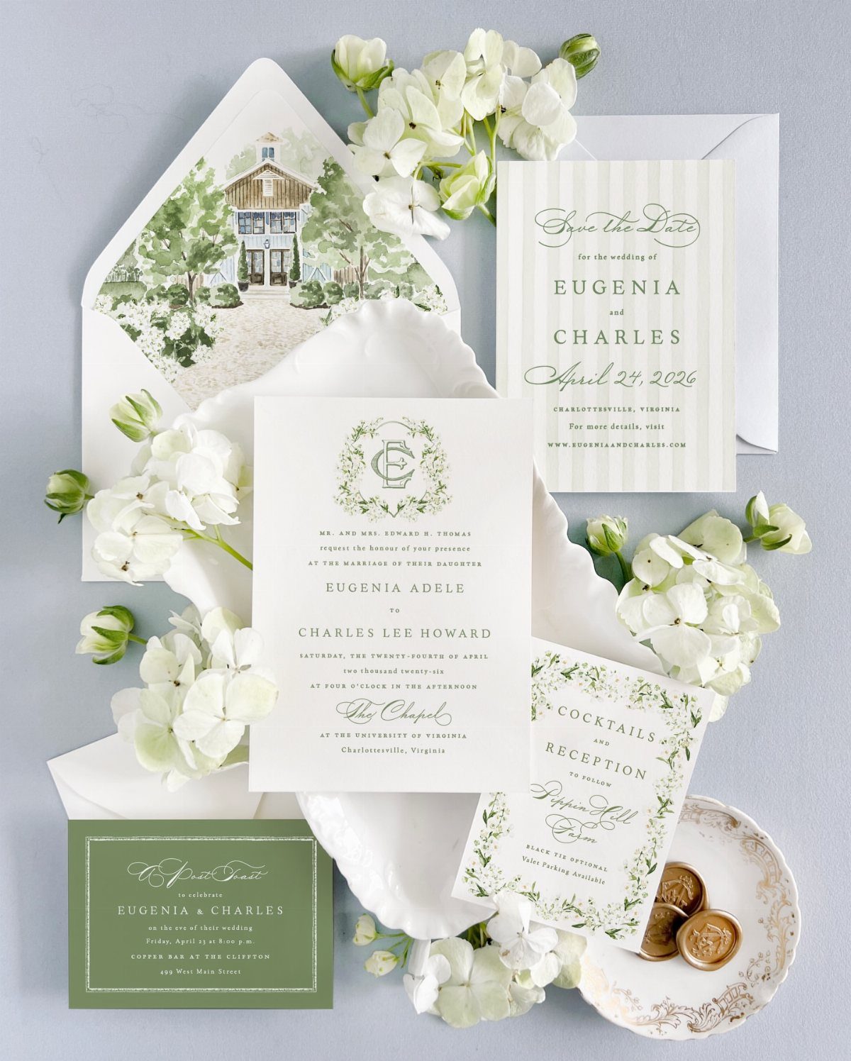
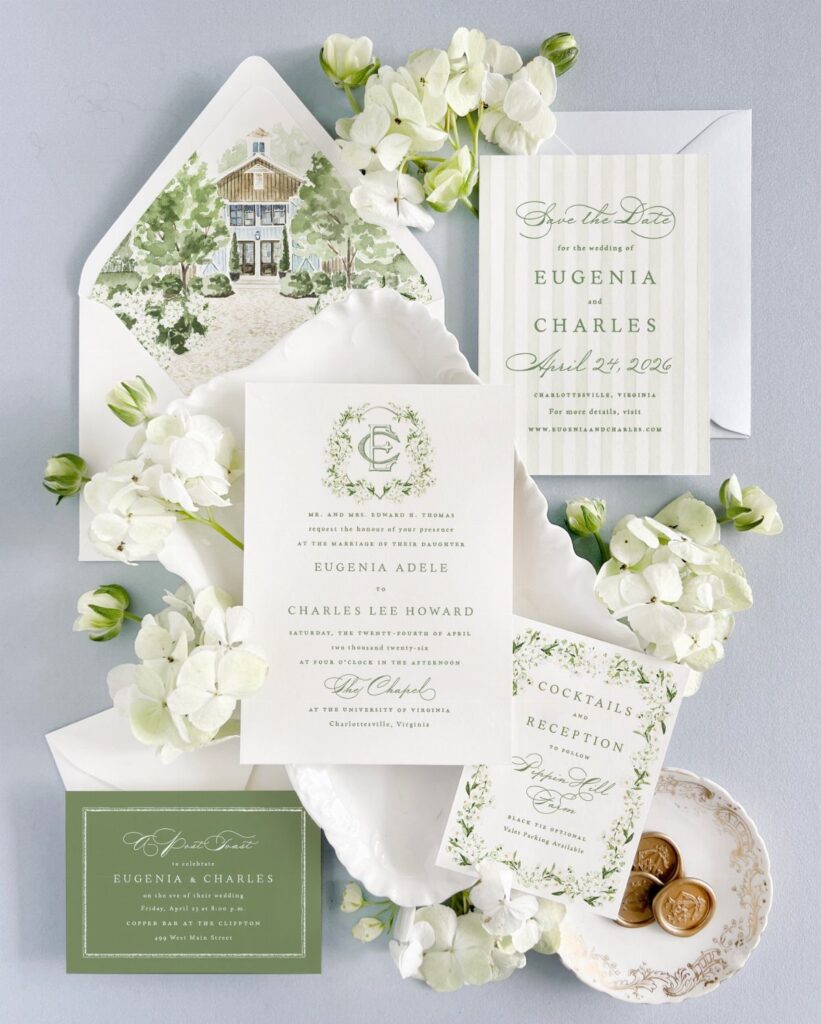
A house drawn from your own front door or venue turns the envelope liner into the one piece guests keep.
I would put the illustration there and let the save-the-date and reception card carry only type, so the artwork has room.
Ask the illustrator to match the line colors to your ink, and to deliver one file you can reuse across the whole suite.
2. Rustic Invitations
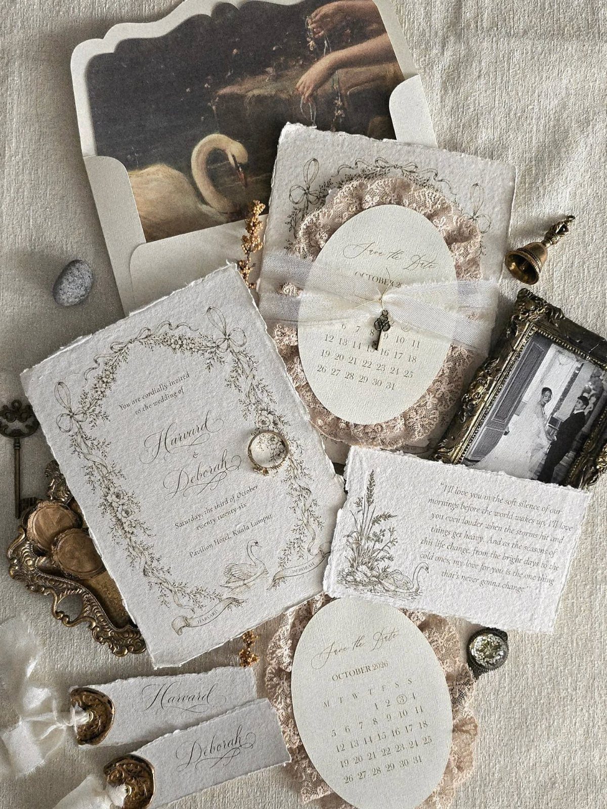
Deckled edges do more for a rustic suite than any prop. Rough, torn-looking paper in cream reads as old and handmade before anyone reads a word.
Pair it with a lace trim and a few vintage-style photographs, then limit the gold to one small accent so the paper stays the star. Too many textures at once looks cluttered, so I would pick two and stop.
3. Foil Stamping
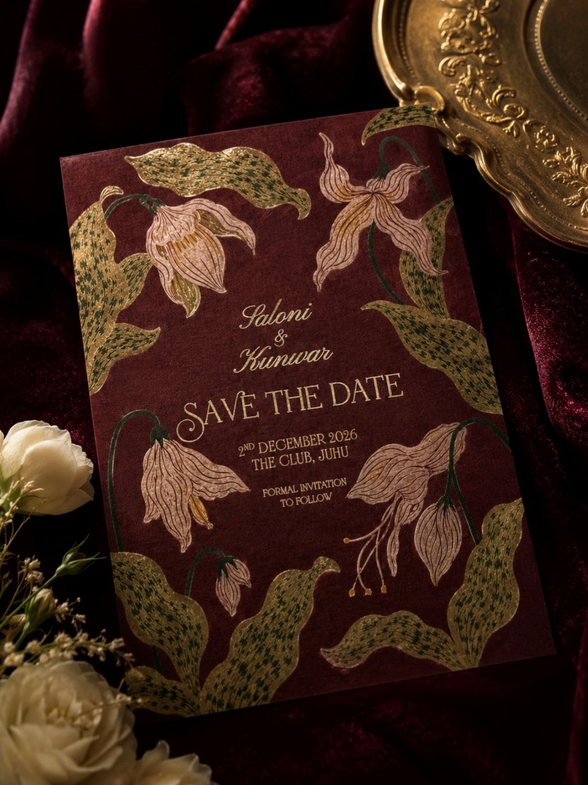
Foil stamping presses a thin metallic layer into the paper, and gold on a deep maroon is the pairing I would choose for a save-the-date. The contrast makes a small card feel formal from across the table.
Keep the foil to florals and the names, and print the date and venue in plain ink so they stay easy to read. Expect it to cost more than flat printing, so save it for the card people pin up.
4. Foil Accents
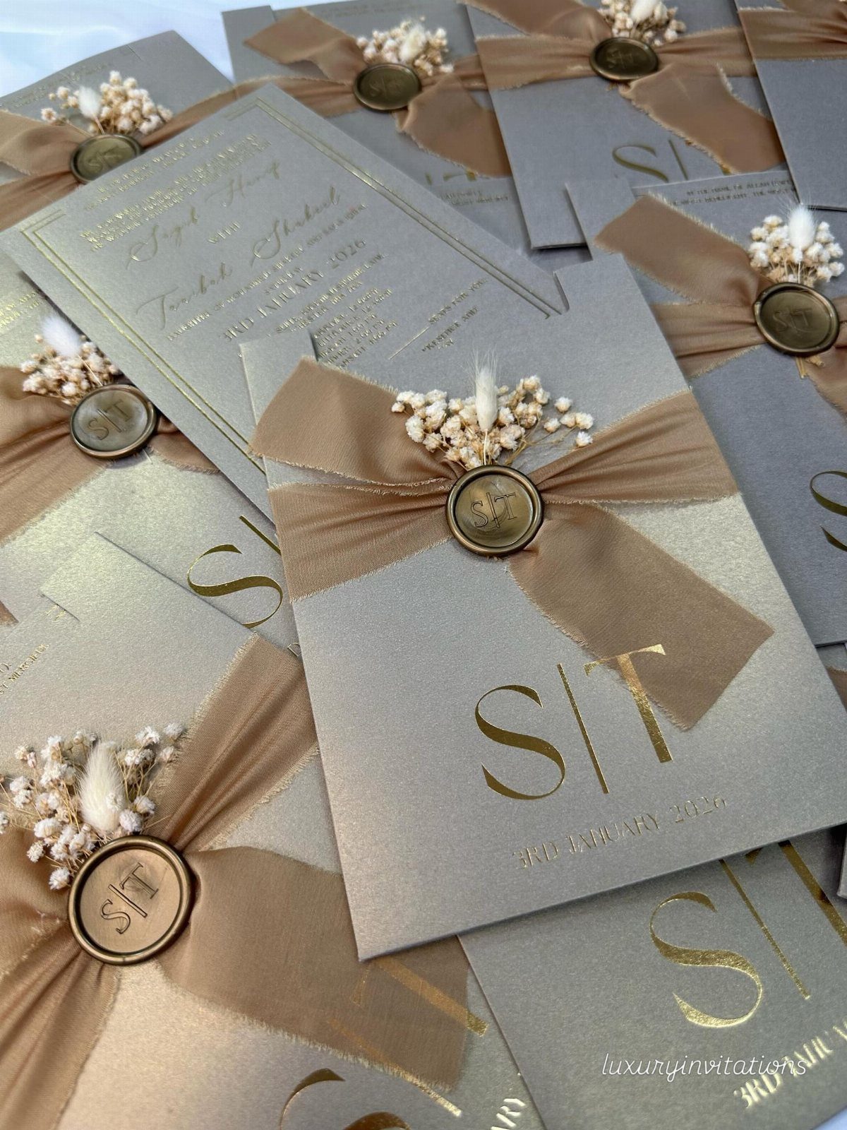
Sparkle works best in small doses: a gold monogram and a line or two of text, not a full sheet of metallic. On grey paper, that restraint keeps the foil looking expensive.
If the budget is tight, foil only the monogram and print everything else.
5. Pocket Invitations
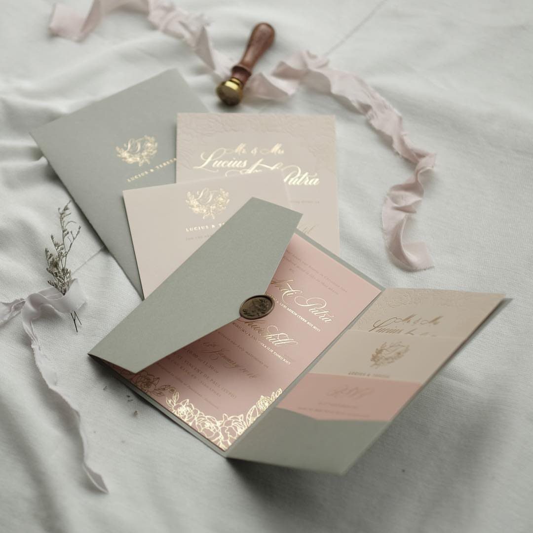
A pocket holds the invitation, RSVP card and details card in one place, so guests are less likely to lose the reply. That is the real reason to choose it over a flat card.
I would add the wax seal and ribbon last, since they take the most hand assembly, and plan extra time if your list is long.
6. Watercolor Designs
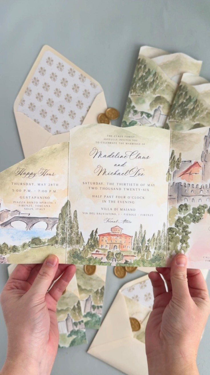
Soft washes of color turn a Tuscan villa and its hills into something closer to a painting handed to your guests. Watercolor suits couples who want romance without heavy ornament.
Have the artist paint a scene tied to your venue or trip, then reuse it on the main invite and a smaller card, like the happy hour insert.
Matching envelopes and wax seals finish it, though proof the colors on your actual paper first.
7. Bold Typography
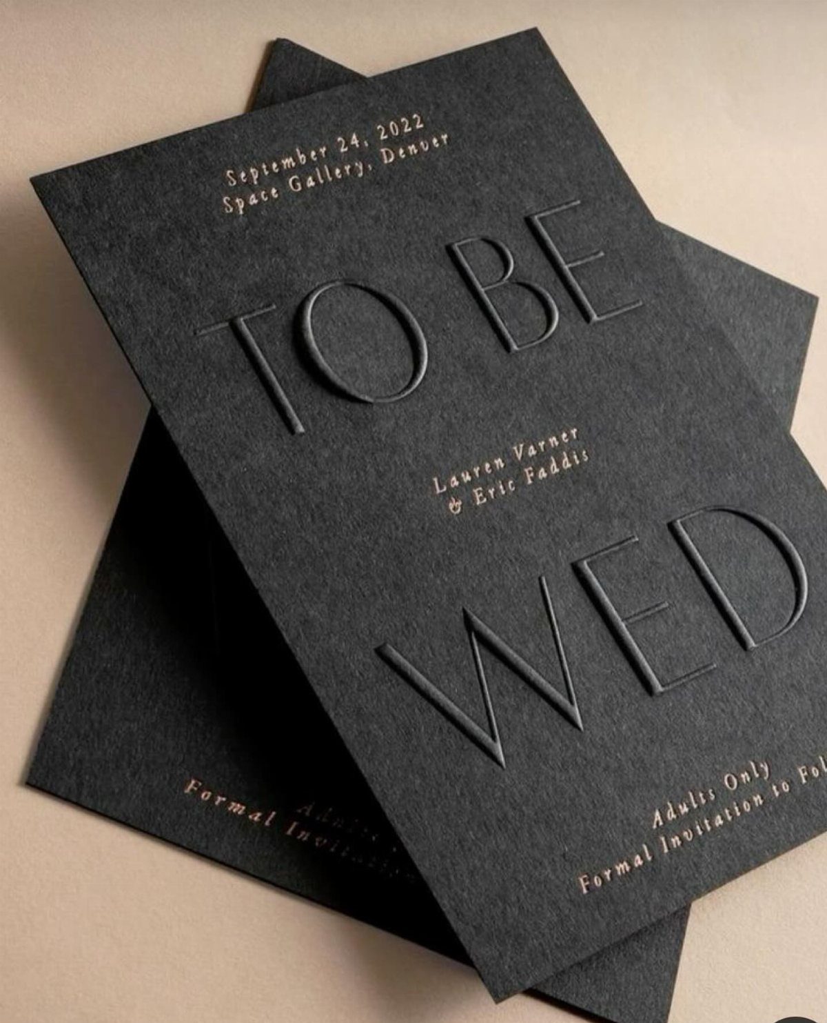
When the words "TO BE WED" are raised and oversized, no illustration is needed.
I would choose one confident typeface, then set the names, date and location in the same family at smaller sizes. Embossing on dark paper shows up through shadow, so hold a sample under a lamp before you order.
8. Floral Motifs
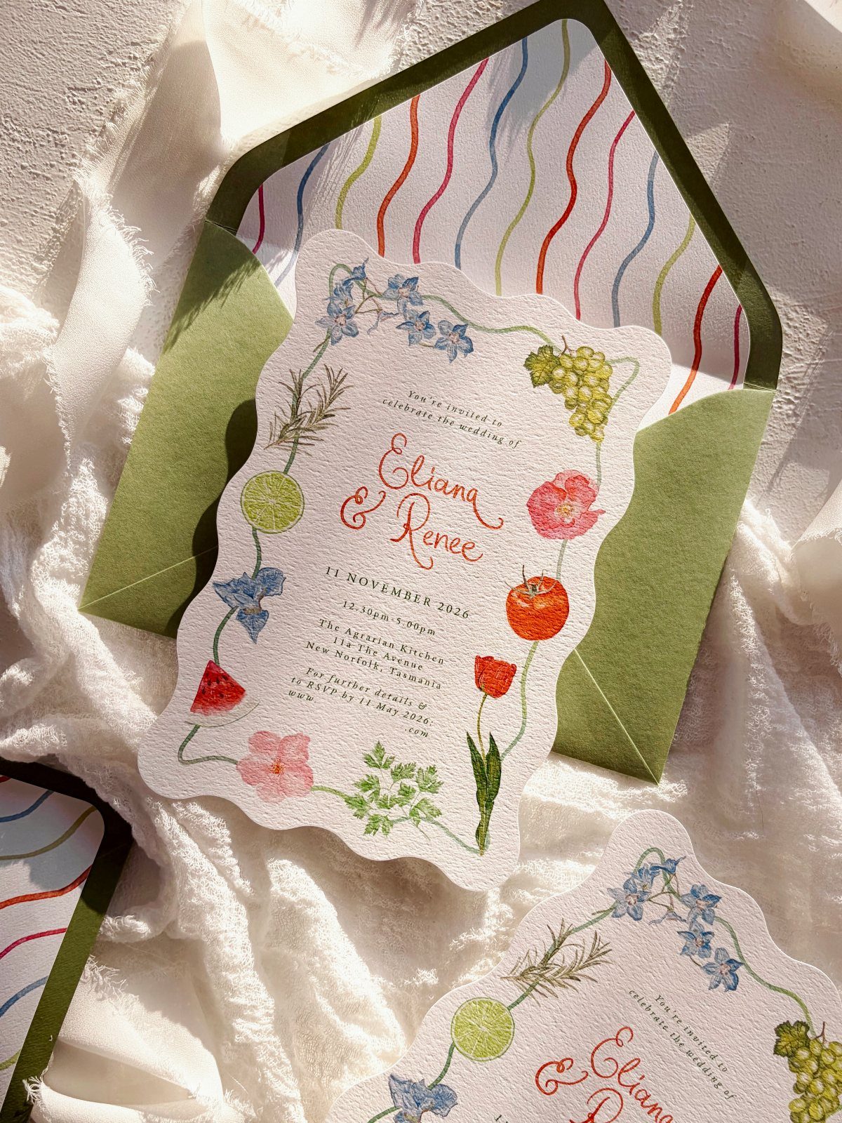
Scalloped edges and floral and fruit illustrations give a suite romance without any lace or ribbon. A striped green envelope tones down a floral card that might otherwise read too sweet, so pick a stripe with some contrast.
Pick one illustration style and repeat it on the invitation and any smaller cards, so the set looks drawn by one hand. Fruit mixed into the flowers is a nice way to make a floral design feel less expected.
9. DIY Invitations
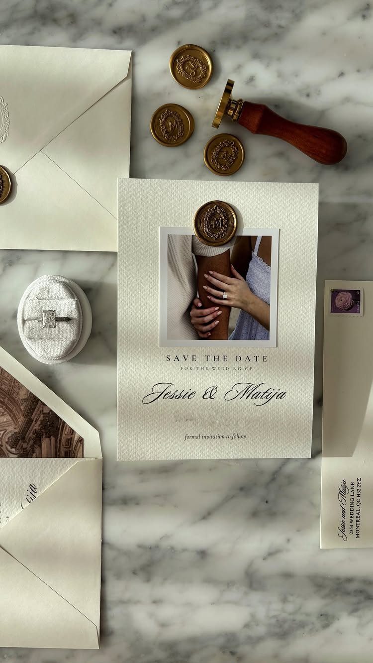
A save-the-date you assemble yourself can carry your own engagement photo, and that is the best argument for DIY.
Seal a few extras first, because the first attempts rarely match. Do the sealing in batches, a little each evening, so a long guest list never turns into one exhausting weekend.
10. Embossed Envelope with Wax Seal
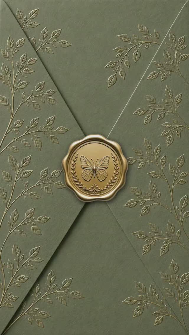
Sage green paper with embossed gold leaves needs very little else. The envelope is the first thing guests touch, so I would spend the effort there and leave the card inside simple.
A gold wax seal stamped with a butterfly sits at the center like a small brooch. Choose a seal motif that means something to you both, and limit the gold to the seal and leaves.
11. Ribbon and Floral Sprig Wrap
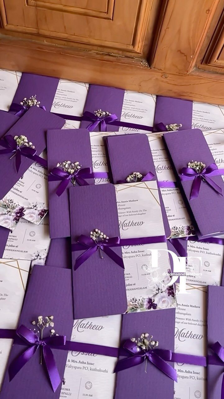
Purple cardstock sleeves tied with satin ribbon and a sprig of baby’s breath make a suite that feels hand-finished. Matching the ribbon to the paper color keeps it quiet, and the white sprig is the one contrast.
Tie one sleeve first to settle the ribbon length, then cut the rest to match. Baby’s breath is the light, easy choice for small sprigs, and it is best added last.
12. Flower-shaped Invitation Suite
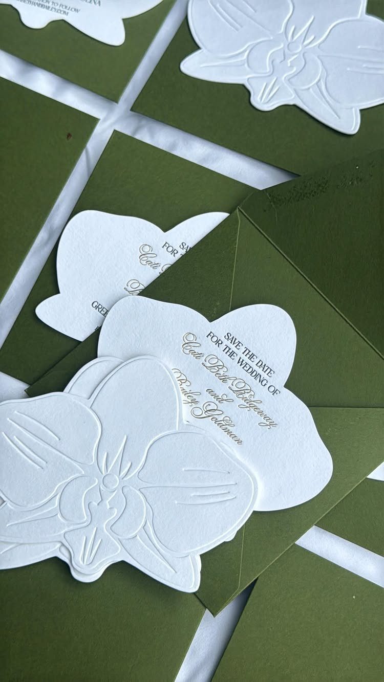
A die-cut flower shape is the whole idea: white petals, gold cursive, and an olive green envelope that frames it. The shape does what a printed border would otherwise do.
Choose gold script for the headline only, and set the remaining details in a simple, readable type. Custom shapes cost more than rectangles, so I would reserve the cut for the save-the-date or the main invitation.
13. Clear Acrylic Invitations
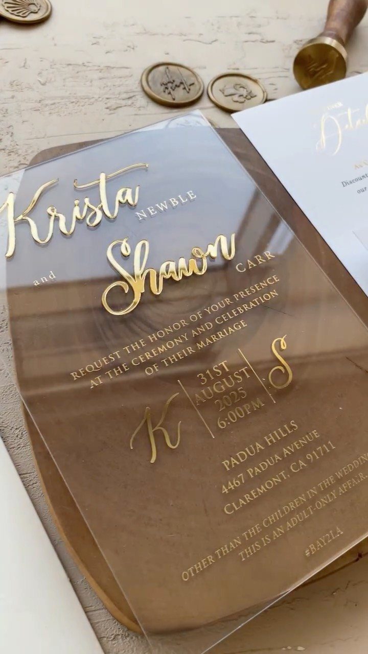
Gold calligraphy on clear acrylic only reads when something sits behind it, so I would plan the backing before anything else. Slip a plain card or a solid envelope liner underneath, and the script stays legible instead of floating.
Clear acrylic leaves little room for text, so keep the wording short: the two names, August 31, and Padua Hills, Claremont.
Gold wax seals work well beside the card, though I would test the gold on a sample piece first, since ink on a transparent surface looks different from ink on paper.
Acrylic costs more than cardstock, so save it for the main invitation.
14. Frayed Fabric Invitations
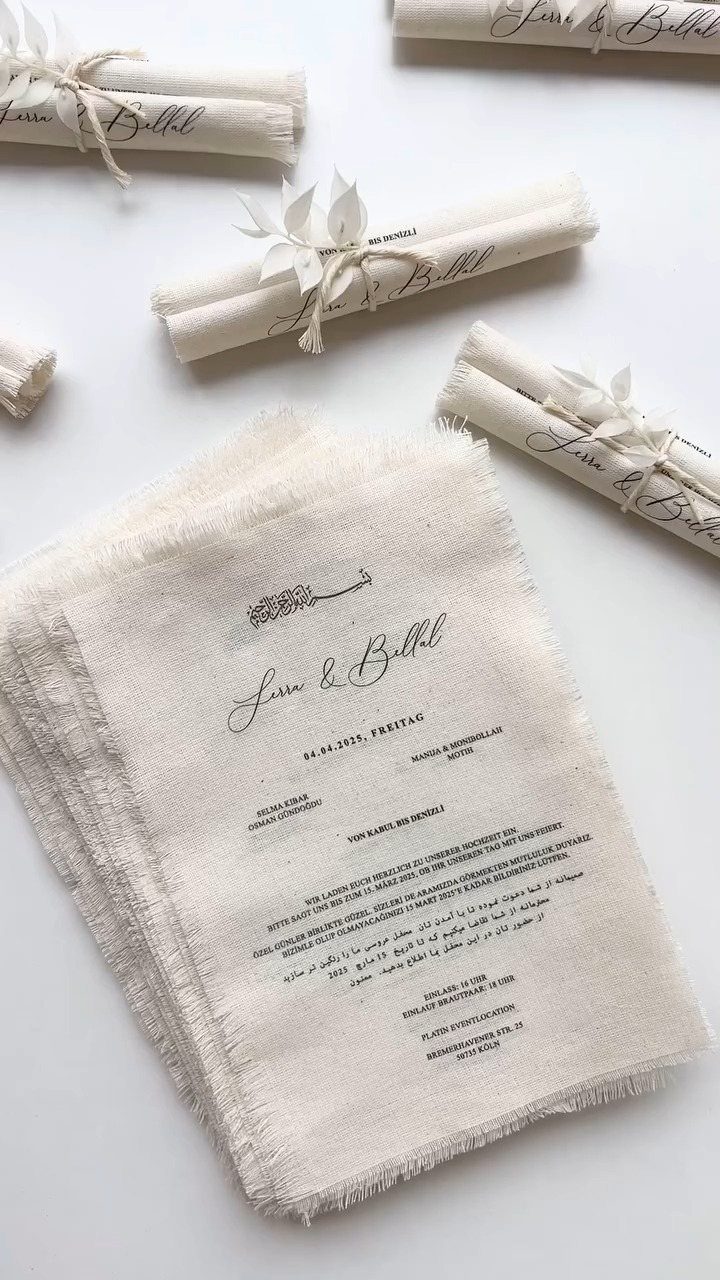
Raw, frayed edges on cream fabric give an invitation a handmade, scroll-like feel that paper rarely manages. Rolling it and tying it with twine suits couples who want something tactile and unfussy.
Keep the wording to the names and date, as in "Lessa & Billal" and "04.04.2025", so the fabric texture does the talking. Order a sample before committing to a full run, because print can look softer on cloth than on card.
Rolled versions take hand tying, so I would budget extra evenings if the guest list is long.
Choosing the Right Invitation Style
Start with the shape of the envelope, because everything has to fit inside it. A card that looks stunning but won’t slide into a standard envelope means a custom envelope, and that changes your budget.
Shape is the option most couples overlook.
A plain rectangle is what most guests expect, so a different cut gets noticed: rounded corners read softer and a little more romantic, while scalloped or bracketed edges help your envelope stand out from the bills and flyers in the mailbox.
Pick the style that fits your theme and colors first, then check that it still looks like you. If the card could belong to any couple, keep going.
Personalization Options
Many printers let you change the design, the colors and the wording, so decide which of the 3 matters most to you before you start comparing.
I would change colors first. Matching your palette is the easiest way to make a stock design feel personal, and it rarely adds much to the price.
Wording comes second. A line in your own voice does more than a custom layout.
Order a printed proof before you approve a full run. Screens flatter colors, and a proof is the only way to catch a typo or a muddy shade while it is still cheap to fix.
Invitation Etiquette
Every invitation needs 5 things in plain view: the date, the time, the venue and its address, who is hosting, and how to reply.
Give the RSVP its own line, with a deadline and one clear way to answer, such as a website, an email address or a return card.
A reply date several weeks before the wedding leaves you time to chase late answers and give your caterer a count.
Read the card aloud to someone who has not seen it. If they can say when and where to show up, the design has not buried the details.
Proofread the date and the address twice.
Frequently Asked Questions
What are unique wedding invitation ideas?
Custom illustrations, unusual materials and interesting print techniques are the strongest places to start.
A custom illustration of your venue or home on the envelope itself gives guests something to notice before they even open it, and metallic foil on a dark background reads formal without needing a complicated design.
Clear acrylic and frayed cream fabric tied with twine are good picks if you want something guests can hold and keep.
How can I personalize my wedding invitations?
Change the colors first, then the wording, then the design. Choosing colors that match your wedding palette makes even a template look intentional, and most printers let you swap colors at no extra charge.
One sentence written the way you actually talk carries more personality than a fancy border, and an illustration or repeating detail tied to your relationship makes the whole suite feel less generic.
What materials can be used for wedding invitations?
Paper is the default, but acrylic, fabric, wood and leather all work and can still be mailed.
Acrylic invitations need something opaque behind them or the lettering disappears against a busy surface. Frayed cream fabric gives a handmade, scroll-like feel, though print looks softer on cloth, so order a sample before a full run.
What should be included on a wedding invitation?
The date, time, venue address, host names and reply instructions all need to sit where someone can find them in under 10 seconds.
Put the RSVP deadline and method on its own line so guests know exactly what you need and where to send it.
Set your reply deadline at least 3 weeks before the wedding so you have time to follow up with stragglers and lock in your final headcount.
Do wedding invitations have to be rectangular?
No.
A rectangle is the default, so anything else registers as deliberate. Rounded corners soften the look, and a scalloped or bracket edge helps your envelope get pulled from the stack before the electric bill does.
Die-cut shapes cost more per piece, so I save them for the main card or save-the-date where they make the most difference.